
Community Health Alliance is a local health clinic operating in 6 different locations in the Reno/Sparks area. They have specialized programs such as W.I.C. — a nutrition and health program for women and children — and The Center For Complex Care. Plus, they have a long list of services including dentistry, and that’s pretty unique for a health clinic. C.H.A. is upheld by their foundation, which carries out funding for special programs and manages community relations.
Basically, C.H.A. has a serious amount of information to share, and a diverse demographic to share it with. They needed a website that was educational, user-friendly, and on-brand. So we got around the table, as we do, and put the pieces together. Here’s what we came up with:
Simple, Category-based Navigation
From the Foundation to their services to their extensive staff, C.H.A. has quite a few dense informational categories that really could stand as their own site. But that wasn’t realistic, or necessary. Instead we organized the site navigation to flow by category.
Easily Accessible Call-to-Actions
With several focuses, C.H.A. also has several, equally important calls to action regarding their various services:
- Donate to the foundation in a few quick steps
- Find locations with ease
- Become a patient in a simple process.
We created calls to action on each page in the same top right corner throughout the site. The consistency seemed like a no brainer, and that’s exactly what this site needed.

Clarity and Consistency For Maps & Services
C.H.A. has 6 different locations, but not all of them provide the same list of services. That was a red flag when we were building their website. Our solution:
We included a searchable map along with the list of locations, and made “find a location” accessible under Services and Contact navigation tabs. We also put find a location at the top of every page, just in case. One last thing: we made hours and contact information for each location easily accessible.

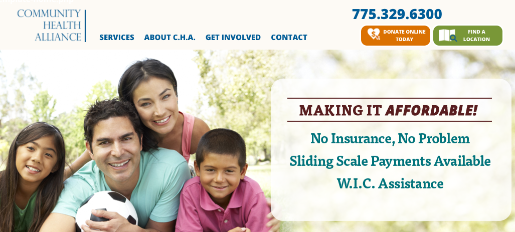
We Crafted A Clean, Informative Homepage:
A rockstar homepage includes enough information for visitors to navigate with ease, without losing them in clutter. We boiled down the entire site to the most valuable pieces of information and weaved them into a clean, engaging homepage.
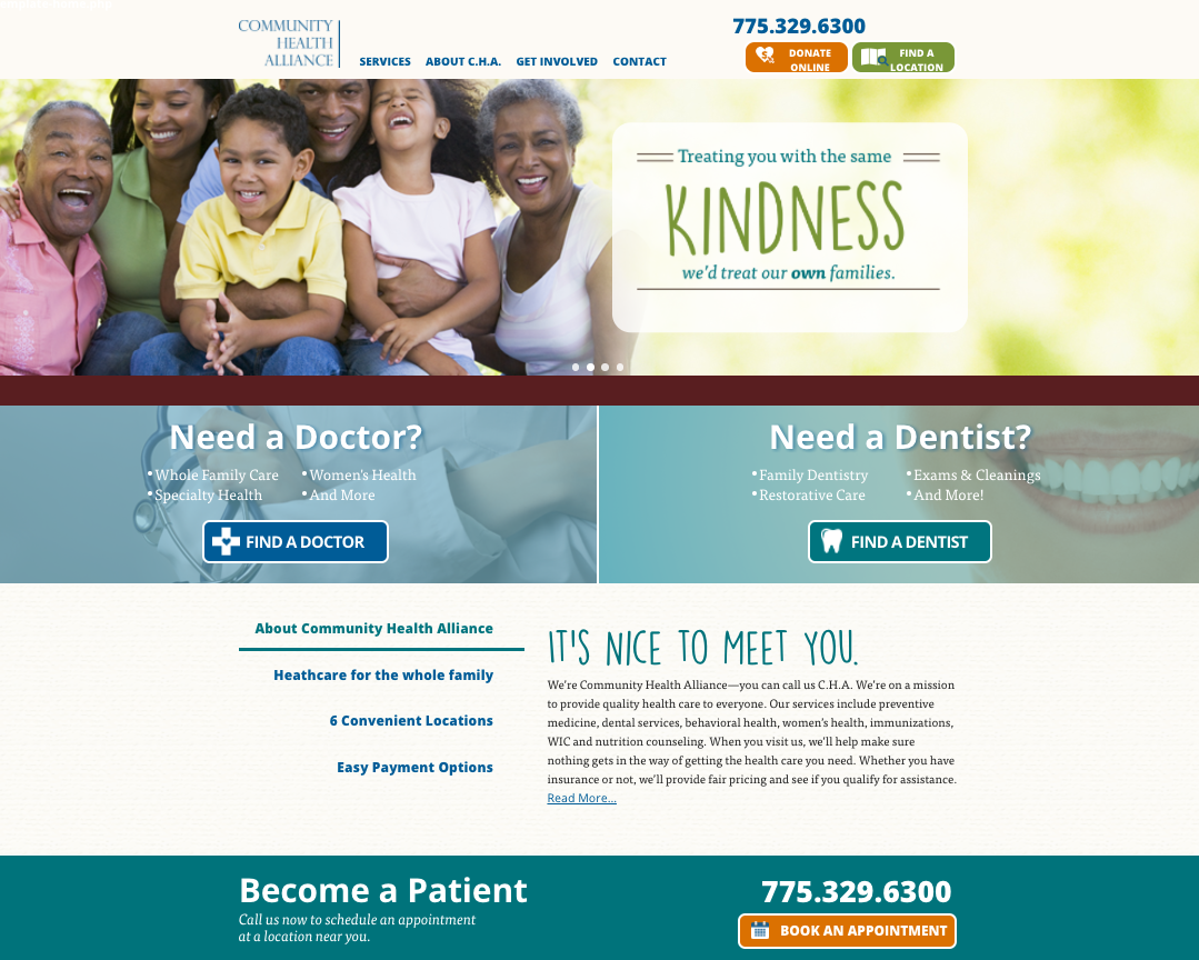
The C.H.A. homepage includes:
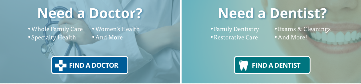
- Clear Calls to Action including “find a doctor”, “find a dentist”, and “find a location”
- Clear navigation bar that also informs visitors there are more services than a typical health clinic.
- Sliders at the top of the page providing vital information and establishing C.H.A.’s values.
- Tabs that allow C.H.A. to talk about a lot of things at once in a more organized, engaging way.
- A map, because with so many locations, we can never have too many maps.
Health care is complicated enough, and the team at C.H.A. was deserving of a website that eased the overwhelm for their clients. We are proud to be the creative team that could help them accomplish these goals.
Recent Comments