
For the next couple of months we’ll be hitting on logos. And we don’t mean we’ll be taking them out for drinks — we do that with YOU. Our team has extensive experience with design, and we’d like to slide some insider’s knowledge your way. If you’re deciding whether a new logo is on the books for your business, take some notes from this logo case study about one of our wildly accomplished clients.
Full Circle Soils & Compost owners Craig and Cody Witt are hardcore soil nerds, and we’re thankful for it. Their compost company based in Gardnerville, NV sells all natural, Nevada-made products to both domestic and commercial clients. Their products are unbelievable, the owners are knowledgeable and fun, but when we met them they didn’t have a logo that represented all the awesome stuff they do.
Before we met with them, we did what any pair of designer’s eyes would do to an unfamilliar company: judge it from afar. By this, of course, we mean we took a long hard look at their logo. From the original design, we saw a small company involved in ranching of some sort — and who might be stuck in their ways.
Here’s the deal, even if you knew the owners only by handshake, you’d know the original logo was misleading.
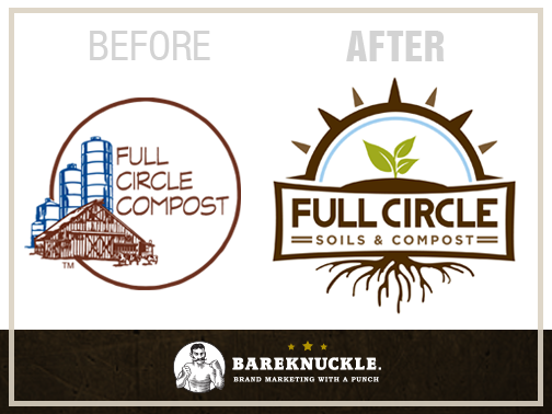
The left logo in the image above is, you guessed it, the old logo. In this example, the company name is inside of the circle, creating lots of white space with low legibility. This posed a problem when the logo was resized for smaller packaging: it was hard to make out the business name at all. While their decision to use a picture of their farm is a historical sentiment for their family, it’s more business owner centric than consumer centric. The thin lettering and pastoral image implied they’ve been around for a while, but what they actually DO was unclear with this logo.
Full Circle sells products that provide energy to plant life and we wanted to make a logo that expressed all of this. Here’s what we came up with:

Full Circle’s original logo was bland, drab and unexciting. Owners Craig and Cody are full of energy. They’re excited about what they do and they bring that kind of life and excitement into every room and every parcel of land they step onto. The rebranded logo is a more accurate face to Full Circle.
Apply It!
- Your logo should create a direct connection between consumers and your product. In the example, the first logo doesn’t visually mention soil, compost or Full Circle’s values. After strategizing with the owners over a beer, they revealed the fun side of soil science with their contagious optimism. We gave them a logo that helped their audience understand just how cool that is.
- Make sure your logo can easily be resized without losing its shape, legibility and overal impact.
- Consider the overall feeling of your logo: how does it make you feel upon first impression?
- As we’ve said before, the logo is only a part of the brand. In order to create a well-rounded, in-depth brand we use The Code, which helps balance the written messaging aspects of the brand with the visual messaging.
Curious about The Code? We thought you might be. Learn more about our process on our website, and check in regularly on our blog to get insider information to apply to your brand.
Recent Comments